A Virtual Conference on Data Literacy

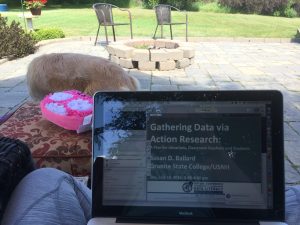
Virtual PD on my patio
One day over the summer, I was scrolling through Twitter and saw a post for the 4T Virtual Conference on Data Literacy. As someone who has presented at the 4T Virtual Conference on Digital Writing, I couldn’t believe that I hadn’t heard of the data literacy arm–and it was coming up in two days! I quickly clicked the link and signed myself up, ready for two days’ worth of virtual PD about teaching students data literacy, and which I could access from my patio.
If you’ve never attended a virtual conference, they tend to work like this: once you sign up, you are sent a link to a virtual room, which you enter a few minutes before the session is slated to begin. Generally, there is some kind of introductory task that allows people to get to know one another. This task also allows a moderator to introduce the presenter and troubleshoot along the way.
Whatever the presenter is talking about is the main reason people attend the session. But the running chat (which move so fast!) among all of the participants often yield tons of great, practical ideas for teachers, too.
The Info on Infographics
I attended multiple sessions, on topics ranging from an introduction to data literacy, to data literacy in the content areas, to action research in the classroom. For this conference, I was most looking forward to the sessions about data visualization and infographics, though. I’ve dabbled with making infographics and have always wanted to have students create them, but I was never sure how to go about doing that, because I didn’t feel that I had a design background.
As the presenters were speaking, something that one of them said really struck me: think of an infographic like an argumentative essay. The infographic itself is the overall argument. The images, design, and information are the evidence and reasons.
Thinking about infographics in this way was like a light bulb going off in my head. Writing arguments with supporting evidence is something students are well versed in, and moving from a traditional essay to a different argumentative form seemed like a great next step.
Get Visual
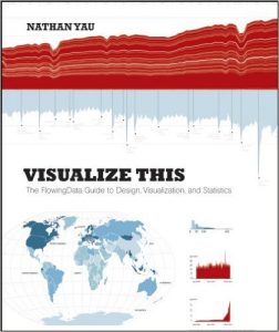
 In addition to seeing infographics in a new light, I also learned, from participants in the chat, about two books that would expand my understanding of data visualizations. The books are Visualize This: The FlowingData Guide to Design, Visualization, and Statistics and Data Points: Visualization that Means Something, both by Nathan Yau. While the books are sometimes heavy on programming language, they greatly enhanced my understanding of how data might be visualized, and why you might visualize a particular data set. They also offered tons of practical (and often free) resources for visualizing data.
As I was reading these books over the summer, I had planned on using with students what I learned. But now that I have moved into the role of curriculum coordinator, I know this learning will be very applicable to my new work.
 Jianna Taylor (@JiannaTaylor) is the ELA/SS Curriculum Coordinator for the West Bloomfield School District. Prior to this role, she was a middle school ELA and Title 1 teacher. She is a MiELA Network Summer Institute facilitator and member of the OWP Core Leadership Team. Jianna earned her bachelor’s degree from Oakland University and her master’s degree from the University of Michigan. She also writes reviews of children’s books and young adult novels for the magazine School Library Connection.
